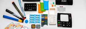
Accessible Custom Silicone Keypads: Increasing Equipment Usability
Making things easy on your users is a key component in keypad and device design. If your equipment is not easy to use, there’s no point to it. It all comes down to this: accessibility improves usability. Mistakes can happen, with inaccuracies the unfortunate result. To prevent that, your accessible custom silicone keypads must increase equipment usability.
We work hard here at Si-Tech to ensure that happens. We want to shift the mindset so usability is front and center.
Why is usability important? Well, every user should be able to use the keypad regardless of their abilities — or in some cases, disabilities. If your company has disabled employees, you have to make sure your keypads will work as intended, while addressing the needs of differently abled people on your staff.
Without full accessibility from your custom keypads, you could lose customers and make costly mistakes. Here are the hallmarks of accessible custom silicone keypads.
1. Use Distinct, High-Contrast Visuals
First off, you should incorporate sharp visuals that allow even operators with poor vision to easily read the buttons. This also serves to help employees operate your equipment in dim light conditions.
Here are some guidelines to keep in mind:
- To guarantee easier readability, make sure the lettering on key labels is in sharp contrast to key color.
- Key color should always be different from the color of the rest of the area so each button stands out.
- Key colors should be put into “function families”—whereby you use colors in accordance with their universal meaning. For example, green should be used for buttons that control start functions, while red should be implemented to stop or cancel actions.
- Incorporate a large, clear font, with concise labels.
2. Use Raised, Textured Keys
In regards to touch operation, custom silicone keypads should have keys that are raised on the surface. Flush-mounted keys can be more difficult to press, so make sure your keys have small bumps and indentations to better guide fingers. Your employees ideally shouldn’t have to even look at the keyboard to know where each button is.
Additionally, group keys with similar functions by shape to make it easier for your color blind and vision impaired users to easily locate particular keys. Don’t ignore tactile considerations in the design of your equipment, especially those based on touch rather than sight.
3. Incorporate a High Snap Ratio
What’s a snap ratio? This is all about the click firmness felt by the user when they depress any key. A high ratio gives you solid auditory and tactile feedback, which as you can imagine is good for visually-impaired operators, not to mention sighted users who operate by touch primarily.
Don’t make the mistake of assigning multiple uses to individual keys so that your keypad size stays small to save space. Your visually-impaired users will have to work extra hard to determine the many functions of each key. Flip the narrative and use multiple keys with only one function to increase usability.
Accessibility and usability of your equipment will impact all people in your organization, so make sure your keypads are highly customized to address these issues.
Contact SiTECH
Call SiTECH Corporation today at 757-887-8488 to learn what we do to ensure accessibility for all your users across all applications.


